The Feedback I have gotten for my contents were mostly good as my audience enjoyed the photos and the layout of the page numbers. They also liked the continuing theme of black, white and red. The only critisiscim I got for my contents was the black box at the bottom of the page and to add an editors photo to make the contents eeem more realistc and proffesional.
Thursday, 28 February 2013
Wednesday, 27 February 2013
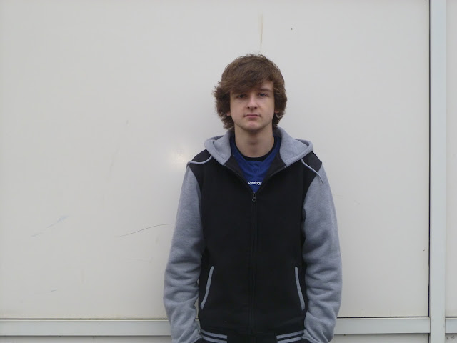
These are the photos I have taken for my contents and double page spread. As you can see I have taken different poses of my artist and a variety of different camera angles/shots. The same location has been used as my front cover to continue synergy throughout my magazine. Tomorrow I will add these photos to my contents page.
Tuesday, 26 February 2013
Contents Draft 1
This is the first draft for my contents page which I have worked on Serif on Monday and Tuesday. This is the layout I have designed with no contents or images added. The black and white theme is still continued as shown, and the contents will atleast have around 60 pages. Today I am going to take pictures for the contents of my featured artist and some for my double page spread
Sunday, 24 February 2013
I have started work on the contents page of my music magazine by designing an initial layout, which all the text will be into three columns, and i've analysed what other bands will be featured also. I am going to take more pictures on Tuesday of my featured artist for the contents and also the double page spread. The black and white theme will also be continued, with the use of red to highlight page numbers.
Saturday, 23 February 2013
Over the week I have planned my ideas for my contents page using feedback and advice and using other magazine's contents such as Kerrang! I have decided to keep the black and white theme and use more pictures of the same artist as on my front cover. By making that picture the largest, It will show that all of the focus of the magazine is on that artist. I have ordered serif so that I can start work on the contents soon
Thursday, 14 February 2013
Mrs D
Well done Jac. You have completed your front cover design and met your deadline. I like the image and the text and colour link to genre well. To improve, make the bar code a bit smaller and avoid using the black at the top cutting off the 'star's' head.
Final Draft for Front Cover
On Wednesday 14th and Thursday 15th of Febuary I constructed the draft of my front cover of my music magazine. The cover is clear on what genre the magazine is aimed at, which is punk, rock and metal music. I have also recieved some audinece feedback from Facebook and Instagram on the draft of my cover.
New Original Photos
On Tuesday 13th Febuary I took some new original images of my featured artist: Jackasnack. These images are of a better quality as they are clear and stand out better on a white background, such as the ones on the last 3 images. One of these images will be use don the cover, while other images will be used on the contents and the double page spread.
Tuesday, 12 February 2013
Picture Ideas
These are the original pictures I was going to use in my music magazine, but I have had to take new shots as the backgrouund was hard to edit with all the band posters, so a new photo will be taken with a plainer background hat gives mor focus to the artist.
Thursday, 7 February 2013
Mrs D
Well done Jac. You have completed your planning ahead of your deadline. You have lots of good ideas that tie in well with your genre and audience. I look forward to seeing some drafts of your front cover soon.
Magazine Double Page Spread Layout: Draft
This is a mock up of what I wish my double page spread will look like in my magazine. The main image will be of the main artist featured on the cover, as the double page spread will be about them I have also decided I will make the artist name/article heading larger, as hopefully this will grab the attention of the reader. I have also decided to add a smaller image of the artist, showing I have used a variety of different photos. The artist Q+A and artist information will be divided into two columns, as hopefully my audience will find this easier to read. The colours I will mainly use for my double page spread will be black and white, to keep in synergy with the cover and contents. The only other colour I will use will be red to show/highlight key information such as sub headings or specific quotes.
Magazine Contents Layout: Draft
This is the preliminary draft for the contents page for my magazine. I have decided to add the contents in columns of three, as hopefully this will be spread out onto the page instead of cramped in one conrer. I have also decided to make the main image the image featured on the cover, as this will show this issue of the magazine is focused on that artist. I have also decided to add smaller photos of other rock/punk bands in this issue. The main colour scheme will be black and white, as this will be the main colours on my front and also some red will be used for article headings and page numbers.
Magazine Cover Layout: Draft
This is my first draft of my magazine cover layout. It is a good design as it shows all the necessary features of a music magazine, including cover lines, main image and artist name/headline. Hopefully with my images and fonts added in, this will appeal to the audience of my magazine. The name of my magazine will be thye largest font on th page, showing clearly what the name of the magazine is and what my audience are buying. Adverts will be used to promote other bands/competions or tecnology such as amps or guitars, but this will not draw attention away from my genre of music or my main artist on my cover. The colours used will be black and white, as these colours can be associated with rock or punk music, and some red will be used to add contrast to the magazine, showing not all of the pages are black and white and plain.
Wednesday, 6 February 2013
Test Shots: Location and MES choices
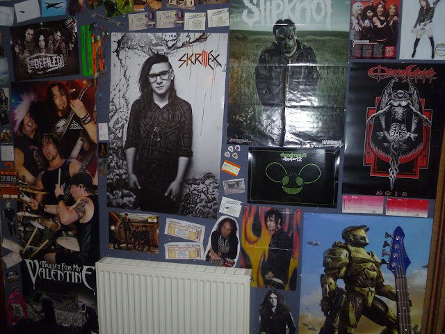
These are test shots for my possible location for my music magazine task. This suits my magazine well and links to my genre as the bands featured on the wall are exactly the kind of music i'm trying to promote, which is Punk, Rock, Metal and possibly Dub-Step. This suits my MES well as the location is dark, serious and definitely matches the music my magazine features. The clothing I am going to ask my subject to wear is dark clothing, possibly a band t-shirt or hoodie, skinny jeans and converse as this is what a stereotypical punk/rock artist would wear so this fits in with my audience and music genre. Bright, fun clothing would give the wrong impression to my target market so they wouldn't buy the magazine, because the image presented would represent the wrong kind of music.
Synergy/House Style
The way my audience of mostly 16-25 year old males will know that the magazine is the same is that there will be a continuous use of black, white and red font throughout my cover, my contents page and my double page spread. There will also be dark backgrounds such as black and the double page spread will contain photos of the same artist featured on the cover, was well as other bands mentioned on there as well. Hopefully this will continue and portray my magazine's theme and genre of music, which is Punk, Rock, Metal etc.
The font used in my magazinen will be consistent and font sizes will vary due to headings and sub headings. The magazine name and the artist name will be the only texts that are differen from the rest of my magazine, showing variety and individuality, and hopefully it will stand out from other magazines and attract my audinece.
The font used in my magazinen will be consistent and font sizes will vary due to headings and sub headings. The magazine name and the artist name will be the only texts that are differen from the rest of my magazine, showing variety and individuality, and hopefully it will stand out from other magazines and attract my audinece.
Mood Board
These are some inspirational photos from the internet which help convey my genre which is Punk, Rock and Metal music. These are pictures of bands and gigs/festivals as well as other images such as skulls and wire which are meant to make the magazine more dark and gothic, as rock and metal music is often associated with this.
Tuesday, 5 February 2013
Test Shots (Subjects)
These are my test shots for my cover for my music magazine. Even though this is not the location and the subjects do not have any props, I am happy with the way the subjects are positioned and the angle of the camera. I have decided most of my shots of my featured artist will be a medium shot.
Font Ideas
These are the different designs for the name of my music magazine. Below are some audience feedback for my designs using Facebook, and the majority of the feedback was that the favored designs were the ones on the top left and right, however all of the designs looked suitable for my genre of music covered, which covers punk, rock and metal.
Subscribe to:
Comments (Atom)


